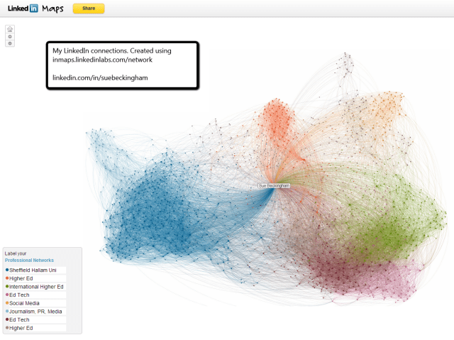
LinkedIn Maps is a really nice way to visualise your connections on LinkedIn. Above is an image taken as a screen shot, however when created online it is actually interactive. Each dot is a node which links to one of your connections. As you click on the node it brings up that person’s photo and headline.
You will notice that there are areas that are coloured differently. By hovering over the different coloured groups you will find this means something to you. You can then complete the legend to give each ‘group’ a meaningful name.
Understanding how your digital network is connected can be incredibly useful. You may be connected to someone who is connected to someone else you share a professional interest with. This is called a second degree connection. Your connection could therefore introduce you to that person.
It is also fascinating to see how your connections are connected to each other. This ‘spiders web like’ map shows the interconnections. Take a look at the video below to see how you can interact with your LinkedIn map and the connections you have. It is your professional world visualised!


Linkedin is very popular professional social media website. Now every company use to promote their services and products.