
I am a very visual learner and absorber of information. I use images rather than bullet points in my presentations to recall information. Recently when I was talking about this I mentioned how much I liked infographics. This term was not known by my colleague and when I explored further others were also unfamilair with the term.
An infographic is a visual way to represent data and is usually presented in a poster format. It a nice way to present sometimes complex information in an interesting way that is easy to digest. A well known example is the London Underground map.

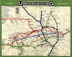
The simplified version we are now very familiar with and regularly use is on the left and the 1908 map version is on the right.
Below is a nice way to simplify the concept.


Reblogged this on totallyrewired.